Now that we’ve revealed the cover for the amazing Perfect Liars by Kimberly Reid (coming in May!), let’s talk about the cover design process. As with Ink and Ashes last year by Valynne Maetani, Perfect Liars is a YA mystery title. How do you give a book that mysterious air you need? How do you tell readers, “This book is for YOU!”?
The challenge in all YA book design is to create a cover that looks like it belongs in the YA section, but doesn’t look too much like the rest of the YA section. And to do that, you need a good designer. We found that designer in Liz Casal, who’s also designed covers for Little, Brown and Soho Press. Looking at her portfolio, we knew she was just the designer for the job.

We always start with some comp designs, to figure out what direction we’ll want to go in. Liz gave us some really amazing options. Here are a few of my favorites (these aren’t all of them).
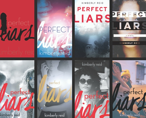 What I loved most about Liz’s designs is the care she put into finding photos of models who would look like the main character, Andrea Faraday, who is biracial (black and white). On top of that, her sense of contemporary design is just spot on. It was hard to choose which one we loved most!
We each loved multiple choices, so how could we narrow it down? I showed the potential covers to coworkers here at Lee & Low, to the author, and to her agent, soliciting opinions. We all had reasons for why we liked what we liked. But which direction was the best direction for this book?
There were some easy ones to rule out—the last one (with the girls in the hat) was a great picture, but didn’t convey the feeling we wanted to convey with this book cover. It was too convivial, not  mysterious enough. As Kim put it, “I imagine totally loving this for some other book I’d write.” A couple others felt too much like other books, and we weren’t sure we liked the cropping of some others (we didn’t want to lose the character’s full face, even though that cropping created a great sense of mystery).
We all loved the red cover (upper left of the original design), but we felt very strongly that a silhouette wouldn’t be the right choice for a book starring a person of color—we didn’t want to obscure our character’s ethnicity, we wanted to celebrate it! However, that book had a very commercial feel to it. Could we tweak it so that it would clearly show that she’s a character of color?
We looked at a number of options for that cover direction, and in the meanwhile also explored a few other options. We narrowed our options down further, looking at filters and cropping, fonts and angles. And then we decided to go to the experts: teens.
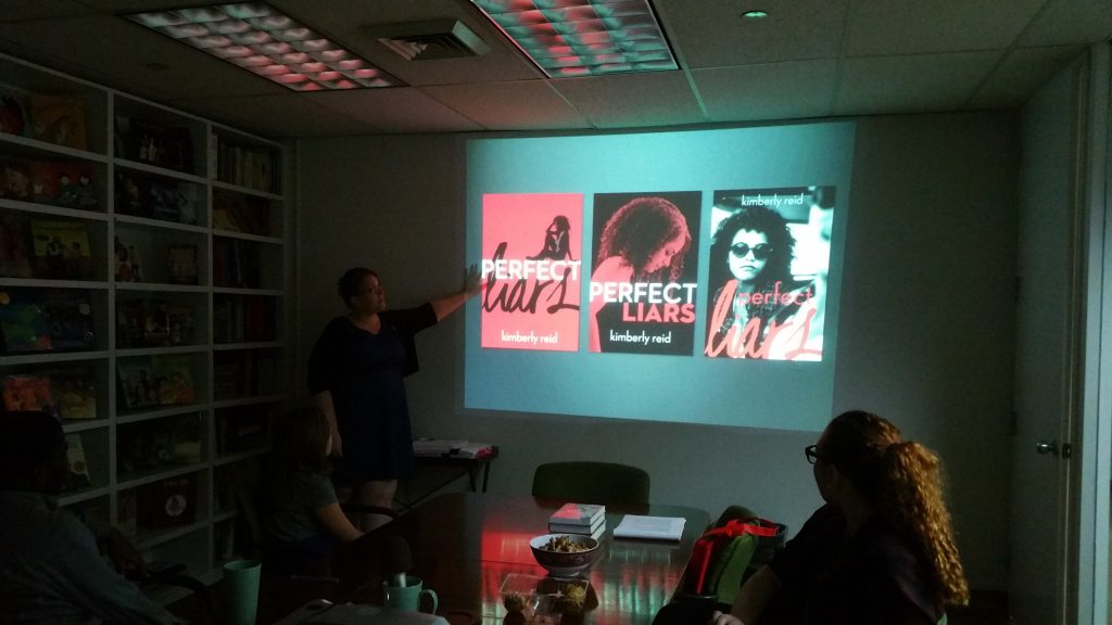
 We chose our three favorite covers (we were on about round 3 by now), and during a visit to our office by students from the Grace Church School (who were there to talk to Joseph Bruchac, author of Killer of Enemies and Trail of the Dead), we asked students to tell us which book they most wanted to read.
Every teen in the room pointed to the cover on the right, the one with the characters wearing sunglasses. We were a little surprised—we thought that opinions might at least be split, or possibly favor the cover we’d been continuing to try to tweak so it wasn’t strictly a silhouette.
Why, we asked, were they most interested in that book?
“Because she looks like she’s hiding something,” said one teen.
For them, those sunglasses meant a sense of mystery.
What do you think? Were our teen experts on to something? We think so!
Check out the final cover at Diversity in YA!


